Photoshop Creations

|

|

|
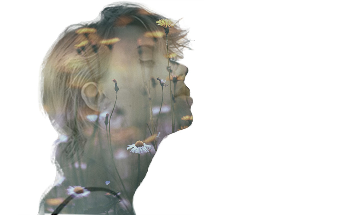
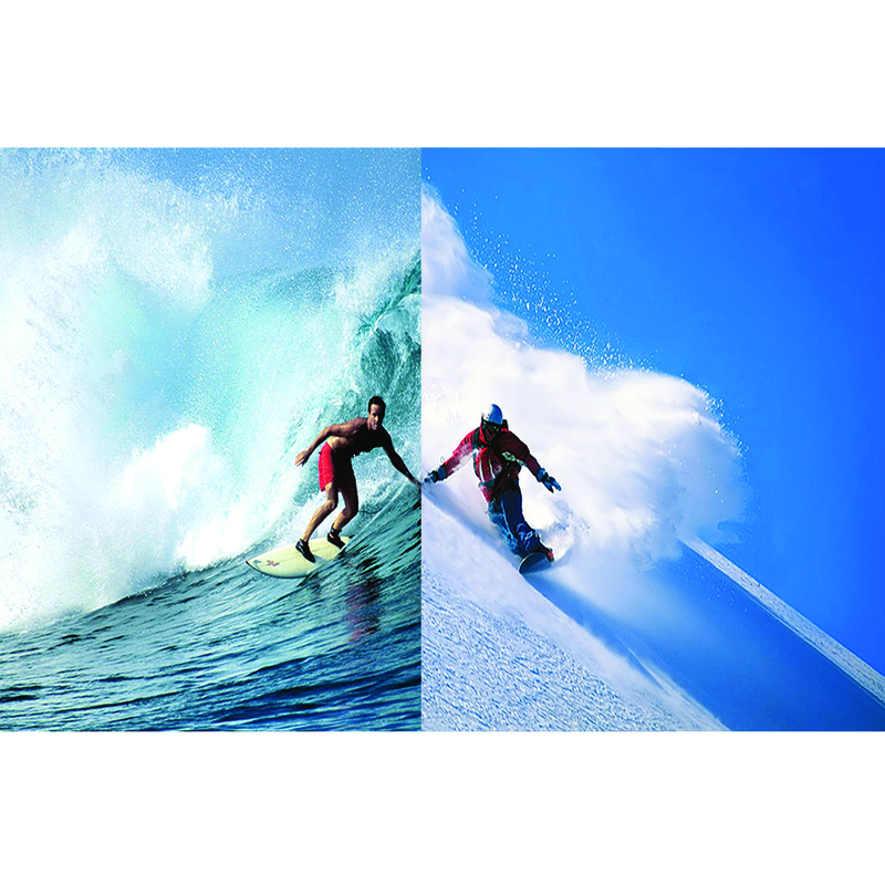
Double Exposure
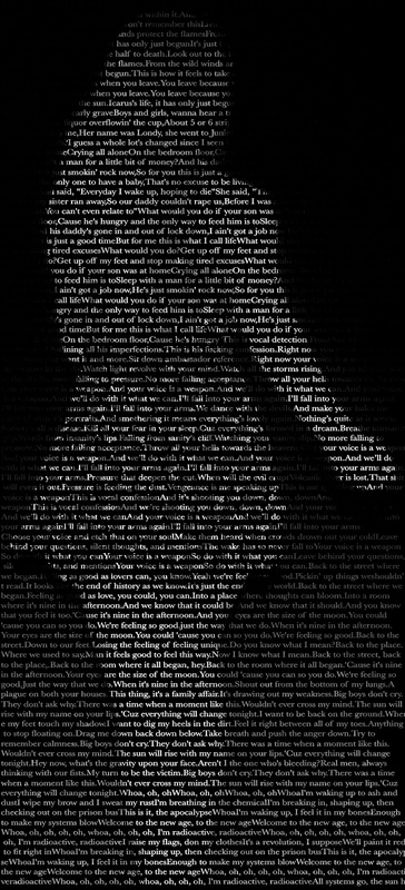
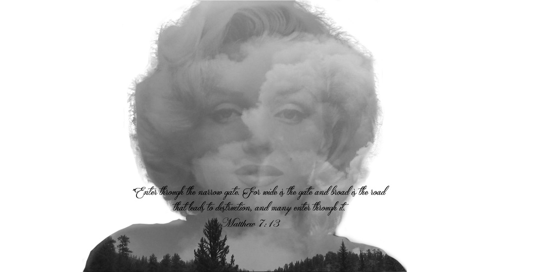
You Are Your Words Project: For the words in this project I picked some of my favorite song lyrics. The reason I picked these is because they all mean something to me or there are memories behind the songs. My songs were Icarus(Bastille), What Would You Do (Bastille), Weapon (Bastille), The Driver (Bastlle), Nine in the Afternoon (Panic! At the Disco), and Radioactive (Imagine Dragons).
Some issues I had while creating this was finding a good text to use and spacing out the songs so that they fit the page. It also took me awhile to figure out how to paste my photo onto another layer but I got it in the end. I really like the picture I chose for this project. I also really like how the words turned out. I like how they fade away at the top.
Some issues I had while creating this was finding a good text to use and spacing out the songs so that they fit the page. It also took me awhile to figure out how to paste my photo onto another layer but I got it in the end. I really like the picture I chose for this project. I also really like how the words turned out. I like how they fade away at the top.

Andy Warhol Art: Something I learned from this project is that completeing tasks on photoshop is not as easy as it looks. It takes a lot of time, effort, and patience. You aren't going to ace this stuff on your first try. If I could change anything about this project it would be my color choices. I would change them so they would compliment each other more.


Typography Creations: Typography is a huge part of the graphic design world. During our unit in Tech Center we had to create special designs like changing logos to connect to ourselves, or combining letters. There is a lot to explore in this part of design.
Near and Far Photoshop Project
|
Juxtaposition Photoshop Project
|

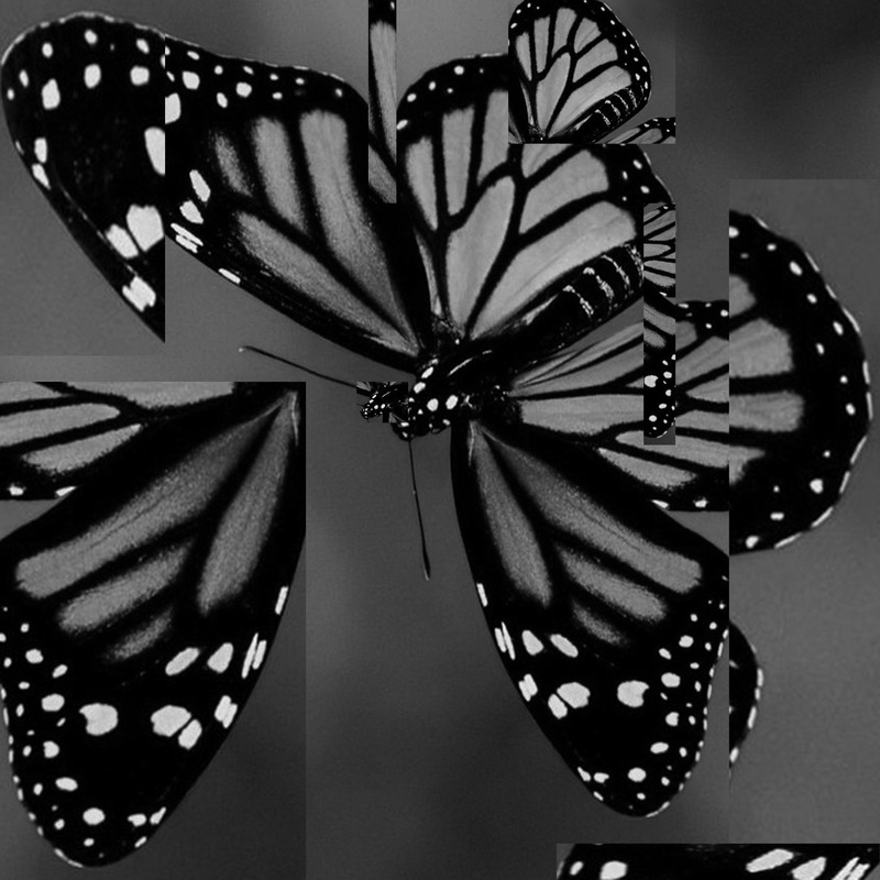
The Filters Project
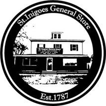
St. Inigoes General Store Logo: During this project I had a lot of issues figuring out how to maneuver the Adobe Illustrator software. How I created my logo by using a picture of the St. Inigoes Store and live tracing into a black and white vector image. The reason why I used an image of the store is because it’s obviously the part of the store that’s been there the longest to its symbol is a big deal. I had to make this image into a vector-based image so it can be blown up to a greater size without pixilation distorting it. I put circles around the images and Wrote on a path in the center, which is how I got the words to curve along the circles.
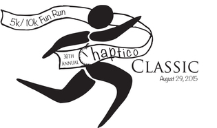
Chaptico Classic Logo: I really enjoyed creating this logo. Mostly because I live in Chaptico and a few of my friends run in this race every year. The steps I used to create this logo were starting off by sketching a couple idea templates until I got the design I wanted. Next I took my favorite template and drew it on a bigger scale by it’s self.
During the time I was doing this project I wasn’t very familiar with the tools in Illustrator, so I scanned my drawing and opened it Photoshop to trace and complete the image. Then I opened that image in Illustrator and live traced it into vector format. I then made a few adjustments to finish it off.
During the time I was doing this project I wasn’t very familiar with the tools in Illustrator, so I scanned my drawing and opened it Photoshop to trace and complete the image. Then I opened that image in Illustrator and live traced it into vector format. I then made a few adjustments to finish it off.
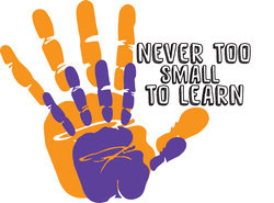
Never Too Small To Learn Logo: The never to small to learn logo is for a St. Mary’s County organization that guides parents in conversation with their kids to help expand their vocabulary. I used this information when I was creating my templates and brainstormed a couple of ideas. This design was actually my second choice but I liked the way it turned out better. My steps to creating this logo was finding a hand print vector on line and opening it up in Illustrator. I used a smaller hand to resemble a child and a color that would compliment the larger hand. Then I found a childlike font that appealed to me to use.
|
|
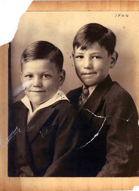
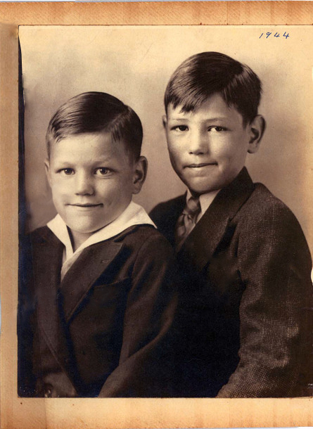
Photo Refinishing
